
Menu


The website "Crisis Pregnancy Center Map" is a directory of Crisis Pregnancy Centers (CPCs) in the United States. The site's home page looked outdated and was difficult to navigate that led to a need for a full redesign that incorporates the same brand elements.
Client
A Swartzendruber, Ty Collins
Year
2022
Responsibilities
User Experience Design, Visual Design and Prototyping
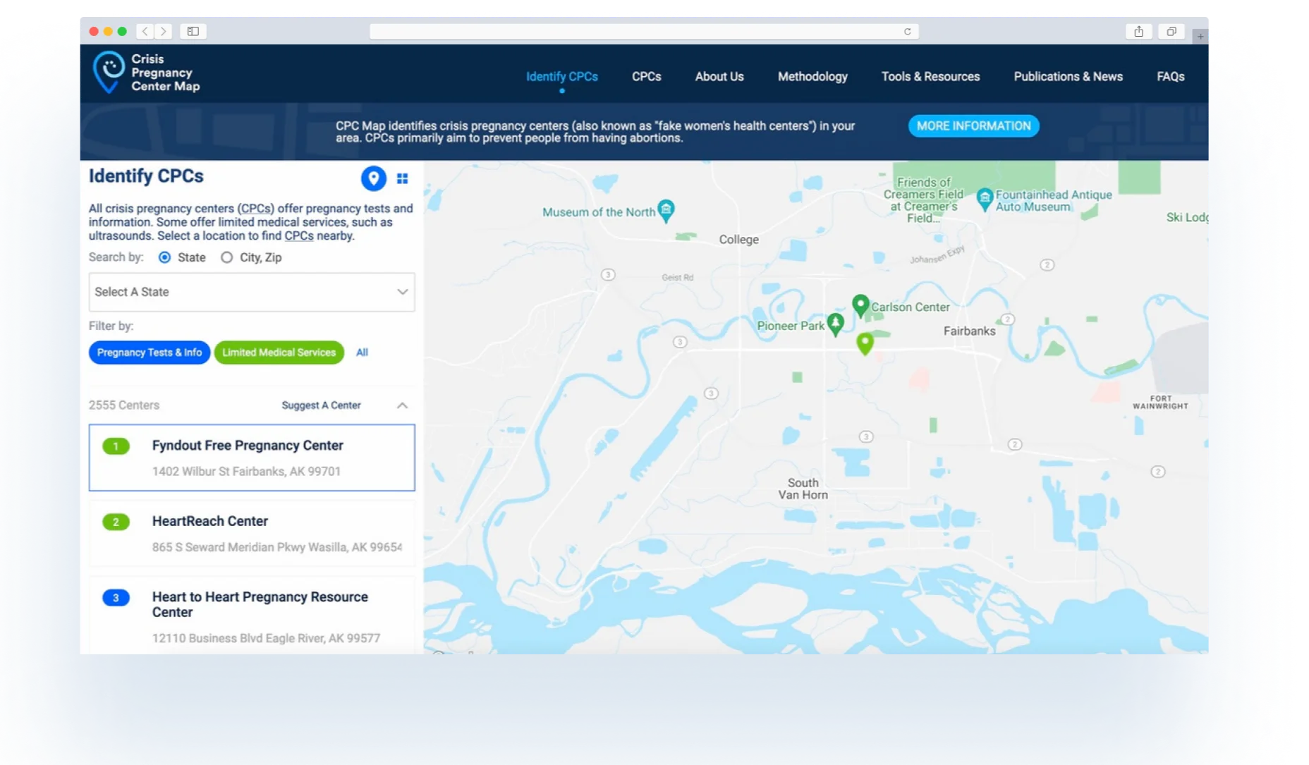
CPC is a website that features an interactive map powered by a Google API and a manual database. The site's home page looks outdated and is difficult to navigate, leading to a need for a full redesign that incorporates the same brand elements. The client's primary concern is improving the site's navigability and updating its appearance.
Understanding the Current Site
Before making any changes, it's important to understand the existing site and how it's currently structured and functioning.
Balancing New Design with Existing Brand
The goal of a redesign is often to modernize the site's appearance, but it's also important to preserve the existing brand elements.
Improving Navigation
One of the main goals of a redesign is often to improve the site's navigability and making it easier for users to find what they're looking for.
Integration of Existing Features
The existing site has features, such as an interactive map or database, that must be integrated into the new design
To begin the redesign process, I conducted a thorough analysis of the existing site to understand its structure, content, and user experience. Based on this analysis, I developed a new design concept that addressed the client's key concerns. My design included a new home page with an actionable element that linked directly to the map, making it easier for users to access this feature.
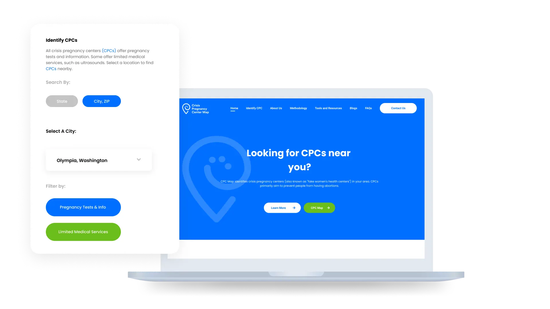
To ensure that the site was easy to navigate, I created a clear and intuitive navigation structure, with prominent call-to-action buttons and easy-to-follow links.
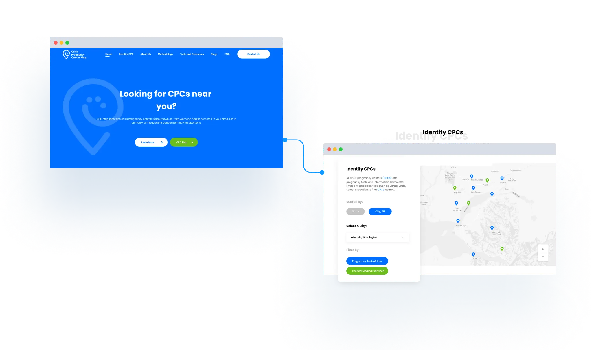
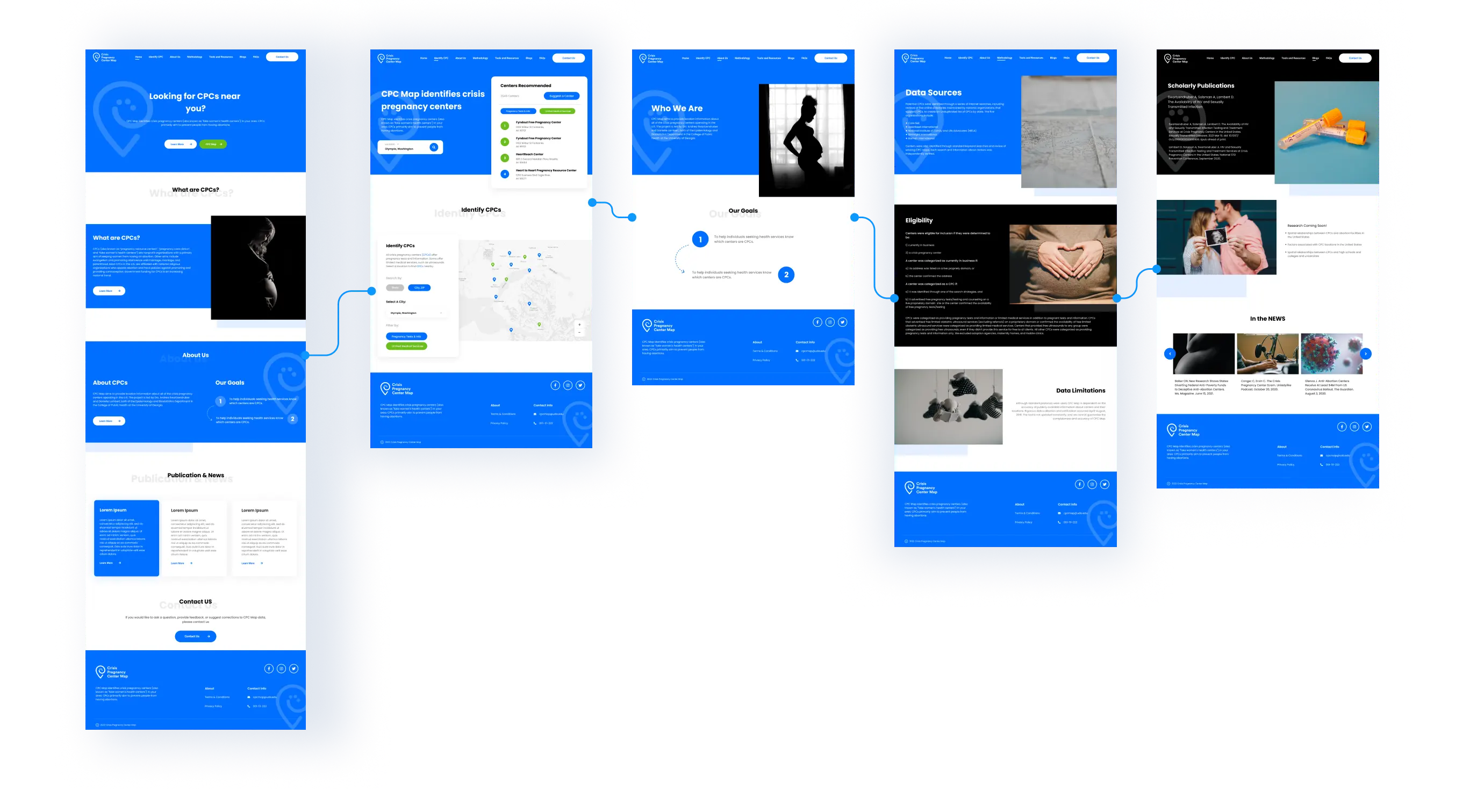
The final result was a modern, user-friendly website that featured an updated home page and an interactive map that was easy to access and navigate. The new design incorporated the same brand elements as the original site, but with a fresh, modern twist. The client was thrilled with the final outcome and reported that users had responded positively to the updated site, finding it much easier to use and navigate than the previous version.

This project demonstrates how a redesign can help to improve the overall user experience of a website and make it easier for users to find and use key features, such as an interactive map. By conducting a thorough analysis of the existing site and incorporating modern design elements and improved navigation, I was able to deliver a website that exceeded the client's expectations.